Cardmaking · Challenges

NBUS Challenge Still Going Strong!!

button-aqua-use-this-the

Hi guys!!  I FINALLY made some time to make a few cards for Darnell’s NBUS challenge that is going on as we speak. If you haven’t checked it out yet, please do. It’s a SUPER fun challenge that anyone can play along but the clock is ticking as we’re in the final week!!  Click here to be redirected to Darnell’s blog and learn all about the NBUS Challenge.

Ok, so on to the card. This card I made because I desperately need a few Birthday cards for Birthday’s that have already passed. Oops!!  I’m sooo bad!!  My goal is to get these cards made and mailed BEFORE the Birthday, but that has yet to happen. I’m working on it though!

So I used the Lattice Grid stamp by Simon Says Stamp for my background. I used Happy Everything by Whimsy Stamps for the “Happy” and Strictly Sentiments 5 by WPlus9 for the “to you”.  I was happy to use my Dymo Embossing Label Maker to print out the “Birthday”.  All of those that I just listed are all NBUS.

All I did was heat emboss the background stamp on Tim Holtz watercolor paper with clear embossing powder, then I just used distress inks to ink blend me a nice background. I used Mustard Seed, Picked Raspberry, Seedless Preserves and Mermaid Lagoon.  Once I had that done, I cut out a circle with my Nested Circles die by SSS and using my Mini Misti, I stamped out the sentiment. I added a few sequins and voila!!  Card complete!!

I love ink blending, but I also wanted to compare it side by side to a watercolored background done the exact same way. So I did the exact same things as I did above, but instead of ink blending, I watercolored my background.  I’ve used both techniques many times before, but I don’t think I’ve ever done an exact side by side of the two different techniques to see which one I like better.  This week, I like the ink blending better.  I very well may have done this before, but as my hubs says, I have the memory of a goldfish….  😜

In the end, I think I like the ink blended card better because it’s more vibrant and it seems… neater.  The colors blend better, therefore it looks neater, I guess. I’m not really sure, but I definitely like that one better.


Since my main focus was getting these made in time for the NBUS Challenge (ahem, I mean getting them out in the mail right away) I haven’t yet edited a process video, but as soon as time allows, I will get this card video uploaded to my YouTube channel. When I do, you will be able to click here to be redirected to my video.  UPDATE: No process video coming. All videos were stolen when my external hard drive, among many other items were stolen from my vehicle last weekend.. ☹️ (see “Robbed” post next)

Thanks so much ladies and…. probably only ladies, for visiting my blog. I’d love to hear from you in the comments below. Oh, and don’t forget to check out my friend, Darnell’s blog. Not only are her posts hilariously entertaining, but she’s uber talented and she created this awesome NBUS challenge, which she runs a couple times a year.

Until next time, my friends ~  I’ll leave you with a few more pix.

Misty

img_5573-copy
Ink Blended

img_5586-copy
Watercolored

img_5577-copy
Ink Blended

img_5590-copy
Watercolored
I’m also entering this into the Simon Says Stamp Wednesday Challenge, which I’ve never ever done so I have no idea how to get the cool little badge on here, but I’m entering anyway!!  Anyone have any tips, I’m all ears…

Cardmaking

Fawning Over You, w/Prisma Pencils

Hi there!!  Hope everyone is having a great weekend so far.  Me, I have a house full of boys right now, but it’s not as exciting as it sounds.  J-man has 2 friends staying the night and they’re attempting to record another video for Jayden’s new YouTube channel.  One of his friend’s is actually pretty good at doing the introductions and keeping the crickets at bay, but then they all look at each other and they start cracking up laughing, so it’s on to the next take.  It’s pretty funny to listen to them as I sit in the next room at my computer, typing away on this post.

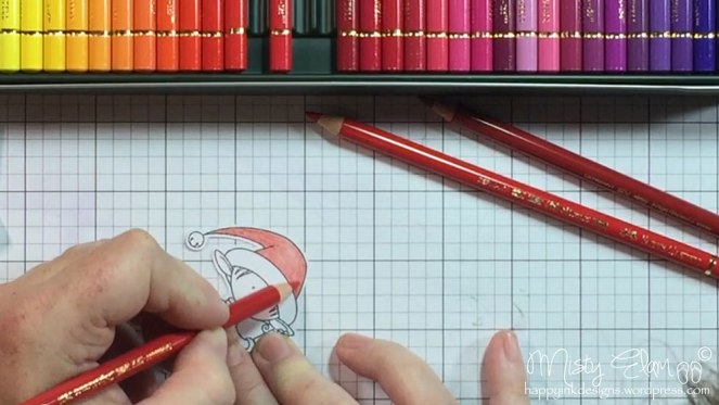
But back to the card.  I originally planned on this being a valentine’s day card, featuring these ADORABLE little deer in love, but then I chose my sentiment and realized that it could be used for other occasions as well.  The stamp sets I used are Fawning Over You by Memory Box and You Matter stamp and die set by Simon Says Stamp.  I also used the Stitched Banner from SSS.  After cutting out my card front with the Wonky Stitched Rectangle die by My Favorite Things, I used my Mini Misti to line up and stamp out all of the images.  I used the Neenah Desert Storm 100 lb. card stock for my card front and base.  Next it was time to color these adorable images!!

I knew I wanted to color this card with Prisma colored pencils, before I even knew what I was doing or what images I was going to use.  I’m so excited that just this week, I received my Faber & Castell Polychromos colored pencils.  I’ve been wanting these for quite some time now so I’m extremely happy to have these in my hot little hands.  But before I can play with them, I decided I wanted to use my Prisma colored pencils on the next card that I made.

img_0320

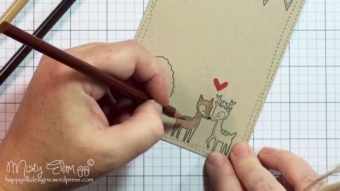
For the deer I used Sienna Brown (945) for the main color and then I added some shading with the Dark Brown (946).  I also used the dark brown on their hooves.  Of course I had to add some color to her cheeks with the Peach (939) pencil.  For the area around the eye and down their chest, I used Ginger Root (1084).

I didn’t really like the spots on their back so I took my White Gel Pen and covered the entire spot in white.  I used Lawn Fawn’s Lobster ink to stamp the little heart above the deer.

img_0320b

I LOVE how this tree turned out!!  I used Apple Green (912) for the overall color and Grass Green (909) around the edges.  The tree trunk was colored with Dark Brown (946).

img_0320c

After I colored them, I added some Gamsol.  I really like how the Gamsol pulls the color out and brings it to the surface.  It gives the image an overall smoothness.  Gamsol works great on Prisma pencils because they are wax based.  The polychromos are oil based and while you can still use gamsol on oil based pencils, it pretty much already has that smoothness to it.

img_0320a

For the pennant, I used the white (938) around the edges and pink (929) and Magenta (930) alternately for each triangle.  Because I went over the lines with the white pencil, it made the black from the ink pad that I used to stamp the image, turn a waxy gray color so I just used a Copic Multi-liner pen to go over that black line again.

I’ve been doing some research on the differences between Prisma’s and Poly’s and it sounds like the two work really well together so instead of getting rid of my Prisma pencils (which is what I had originally planned on doing), I think I’m going to hold on to them and test them out to see how the work together.  Polychromos are more translucent and Prisma’s are more opaque so if you wanted to put a lighter color over a darker color, Prisma’s would be the way to do it.  It wouldn’t work out too well with the Poly’s.

img_0320e

I used the “You” die from Simon Says Stamp on a really pretty dark red card stock, but it came out of my scraps bin, so I have no idea where the paper came from.  For the rest of the sentiment, I used the matching “You Matter” stamp set from SSS.  I used a Stitched Banner die from SSS and heat embossed the “Make Me Smile” portion of the sentiment.  I used a white embossing powder on black card stock.  The black card stock is called Licorice Twist from Bazzill.  It’s my favorite black card stock.

I let the banner hang out over the edge of the card front and simply trimmed off the access.  Then using my Zig 2 Way Glue Pen, I glued down the sentiment.

img_0320k

And since I hadn’t added any dimension yet to my card, I decided to pop up the card front using some Craft Foam.  I always use the Be Creative (or Scor-Tape) to adhere my craft foam down because I know it ain’t going anywhere once I stick it on there.  It is awesome adhesive!!

img_0320l

To finish off my card, I added some much needed sparkle to the “You” and the little red heart above the deer.  I used the Spectrum Noir Sparkle Pen in Crystal Clear.  What a amazing pen that is!!  I LOVE my Wink of Stella and I always will, but the S.N. pen leaves such a beautiful layer of sparkle behind.  Lastly, I added some Glossy Accents to the heart and attached my card front to a matching red background.  Using my ATG, I attached all of that to a Neenah Desert Storm card base.

To finish off the inside of my card, I used this Scalloped Stitched die from Gina Marie Designs to add a white insert, since the card base is the color of kraft card stock.  img_0320i

img_0320-m4v

img_5561-copyimg_5563-copyimg_5566-copy

And then my card was complete!!

button-aqua-use-this-the

So as I was finishing this card, I found out that my friend, Darnell was doing her awesome NBUS (Never Before Used Schtuff) challenge again right now and it just so happens that the first weeks theme was colored pencils and kraft card stock.  Well, unfortunately I was a day late entering for that particular theme, but fortunately for me, the challenge is still going on!!  She’s doing a 3 week challenge and each week has an optional theme.  Since I missed the theme for the first week, I didn’t bother entering, this particular card but it just dawned on me that the theme is optional!!!  So, since I did use NBUS, I’m going to go ahead and enter this in the final week of this oh so fun challenge.  I encourage you to check out her blog here.  She’s very entertaining and extremely talented.  I promise you you’ll have a blast if you join along in this challenge.  We’re in the final week, so go check it out right now!!!  If you miss it, don’t worry.  She does this challenge a couple times a year so be sure to follow her blog so you’ll be notified when the next one is happening.

Thank you so much for taking the time to check out my post. I hope you guys are having a fabulous weekend!!

Blessings,

Misty

Cardmaking

Awesome Mini Haul Featuring Polychromos Colored Pencils

Hello fellow crafters!!  I am so excited to share my new goodies with you guys!!  I just received my order from Amazon yesterday and had to bust out my camera to shoot a quick little video, which is up on my YouTube channel.  Click here to be taken directly to that video.

I was actually going to get myself these for Christmas but we ended up spending all of our money on our kid and, well, hubby and I got a whole lot of nothing for Christmas, which is ok.  I’d much rather see the kiddo’s get what they want.  But now that Christmas is over and we have another paycheck under our belt, I couldn’t resist the urge any longer.

So the first item I received was these Tombow Dual Brush Pens.  I went with the Bright Palette.  I thought it was a good place to start.  And then I also purchased a separate dark green color for coloring Christmas trees!!  Always thinking ahead…  (not really)  I’m looking forward to learning how to use these though.  I see some ladies making beautiful things using them.

img_0328-m4v-still002

Then I got this adorable little cutting board thanks to Jennifer McGuire.  I saw it either on her YT channel or on her blog, I can’t remember, but I have a huge pizza paddle that I use at the moment and it was just time to get something smaller, now that I know I will use it.  The pizza paddle has been sufficient up until this point because I just wasn’t sure how much watercoloring I would do.  I’m happy to report that I LOVE watercoloring so new cutting board it is!!

img_0328-m4v-still004

And lastly, the moment I’ve been waiting for….  I FINALLY bought myself these beauties!!!

img_0328-m4v-still005

AAAAAHHHH!!!  I’m still so darn excited just looking at them!!!  I will admit, I haven’t experimented with colored pencils as much as I would have liked to, but I did just make 2 cards using my prisma pencils and I really enjoyed using them!!  I even did it on kraft card stock (stay tuned for my next post and video to see those cards).  One of my crafty goals for 2017 is to learn how to utilize my colored pencils more efficiently and to learn all the different mediums I currently own but haven’t made the time to learn or understand yet.  I actually have quite the list of crafty goals for 2017.

img_0328-m4v-still006

I had originally planned on getting rid of my prisma colored pencils but since the polychromos are oil based and PrismaColor is wax, I think I’m going to hold on to the both of them and maybe do a side by side comparison in the near future…

img_0328-m4v-still008img_0328-m4v-still009

LOOK HOW PRETTY THEY ARE!!!  And they feel so good!!  I know, that sounds kinda weird, but they are really soft and smooth feeling.  I just couldn’t stop “petting” them….  hahaha

Ok, let’s just scratch that last sentence and pretend it didn’t happen…

Moving on…

img_0328-m4v-still011

I just so happened to have some images close by so I decided to test these babies out.  I could immediately feel a difference between the Prisma pencils and these Polychromos.  These were just so smooth and creamy and had an all over great feeling to them.  And I can’t believe how nice they color!!  And since I had just made a card the day before using my Prisma’s, I had some Gamsol still sitting out on my desk.  I figured I might as well give it a try and see how it turned out.

img_0328-m4v-still012

And I surely wasn’t disappointed.  That’s one thing I didn’t care for with the Prisma colored pencils is I felt like I HAD to use Gamsol with them.  I know I didn’t, but it just looked so much better, with it..  I feel like without it, it looks like I’m coloring in 3rd grade all over again…  That probably doesn’t make any sense to anyone but myself, but that’s ok.   I’m changing my tune for these ones.  The polychromos just have an all over smoothness to them, which I can’t wait to put to the test.

And that’s it, folks!!  Hope to see you guys next time.


Cardmaking

Sending Valentine’s Day Hugs

Hi there!!  I have this super easy, super quick Valentine’s Day card to share with ya.  I actually used my Silhouette Cameo on this one.  I used design #54494 by Lori Whitlock and a few other supplies.

img_5521a

img_5523

This card was really easy to make.  The envelope, wavy card front and banner were all part of the Silhouette design.  All I had to do was put it all together!!  Hope  you like this.  I wanted an easier post.  I usually break down my card with lots of pictures and step by step instructions on what I did.  This time, I’m just going to list what products I used.  If you prefer the step by step version, just let me know.  I just want to do what people want to see and it seems like my step by step process goes on forever.  But if that’s what you’d rather see, that’s what I’ll do!!  I can do it either way.

Before I go, here’s a link to my YouTube channel where you can see me making this card.

And lastly, my 9 year old son has decided that he wants to make YouTube videos as well so he uploaded his very first video last night.  It’s a How to Change Your Skin in Minecraft video.  I can’t even tell you how giddy and excited he was.  I would LOVE it, if you guys would take a second to go “like” his video.  As soon as he opened his eyes this morning, he had to jump on the computer to see if anyone had “liked” his video yet or subscribed.  Sadly, it was only me….  So please, make a boy happy and click on that like button and if you have kids or grandkids that are as obsessed with watching YouTube as my son is, invite them to subscribe to his brand spanking new channel.

Supplies Used:

Silhouette Design #54494

SSS Sending Die

SSS Sending & Wishing Stamp set

Lawn Fawn Hearts die

Craft Foam

Glitter Cardstock from Martha Stewart Crafts

6×6 Patterned Paper from Echo Park – Blowing Kisses

40 lb. Vellum from Ellen Hutson

1/8″ Be Creative Double Sided Adhesive


Cardmaking

Easy Distress Ink Watercoloring Featuring Birch

Hi guys!!  I’m back with another card featuring the ADORABLE Birch from Purple Onion Designs.  I think I’m in love..  with Birch, that is.  He’s just so stinkin cute.  I could make cards for days using him!!!

Well this card was super easy to make.  I used the same distress ink colors to color him as I did on my previous card, which were Antique Linen and  Vintage Photo. I also used Tattered Rose for his ears and cheeks.  I colored his beanie with Wilted Violet.  I stamped him on some Strathmore Ready Cut Watercolor Paper. The 3 images on the left I heat embossed with Wow Black Embossing Powder and the 3 images on the right I stamped using Archival Jet Black ink.

img_0198-m4v-still001img_0198-m4v-still002

I’m still using one of my all time favorite paint brushes which is the Black Velvet Silver Script Liner 1.  It’s a really great brush for smaller images like this one.   After he was all colored and dried, I used a Sakura Silver Gel Pen to add some silver stripes to his purple beanie.  I really like this silver metallic gel pen.  It’s especially great on Christmas cards to add just that little bit of extra sparkle.

img_0203-m4v-still001

For my card front I used Lawn Fawn’s Simple Stitched Hillside Borders die.  I knew I wanted a portion of the card front to be removed so that some color could show through.  As always I’m using Neenah Solar White 110 lb. card stock for my card base and Neenah Solar White 80 lb. card stock for my card front.


img_0203-m4v-still002

I used my Clarity Brushes to brush on some of the Wilted Violet.  I was a little concerned because my brush was still wet from the previous card I had made.  I wasn’t sure what that was going to do to how much color came off the brush.  Usually, you get a really nice, light layer of color, but with it being a little wet, the color was a little more intense.  So I just brushed it on super light and super slow so that I didn’t end up with too much color and have to start all over again.

img_0204-m4v-still001

I really like these Clarity Brushes.  I love ink blending, but I always end up with one side (where my sponge first makes contact with the paper) being waaaay too dark.  That doesn’t happen with the Clarity Brushes.  You can start smack in the middle of your card and no one would ever know.  With ink blending you usually start off of the page and work your way on, but we don’t always want the color to come in from the side.  And no matter how hard I try, I always end up with a dark spot, where my sponge first touches the paper.  I’ve seen people start right on the card stock with the ink blending tool and have no problems.  No darks spots, no weird circles, just a nice even blend of color.  But then there’s some of us that just can’t do that.  This is the category that I fall into.  So I’m very pleased with the Clarity Brushes.

Once I had some color on my background, I kept using the card front as a guide to see how much color I wanted showing and how dark I wanted it.

img_0204-m4v-still003

I definitely wanted a light layer of color, almost pastel-like.  I planned on adding my sentiment to the bottom so I also had to pay attention to how far down my coloring was going.

Once I was happy with the amount of color I had down, I used my EK Success  Powder Tool across the bottom of the card where I wanted my sentiment to go.  It’s important to use an anti static tool, especially when you’ve already added color, so that the embossing powder doesn’t stick all over the place.  Sometimes your ink might not feel wet or look wet, but if it is, your embossing powder will stick all over that wet ink.  It’s best just to make sure the ink is completely dry before adding any embossing powder.

img_0204-m4v-still004

After I used the powder tool, I inked up my stamp with Versa Mark Ink and stamped my sentiment across the bottom of my card.  The sentiment I used is from a stamp set by Simon Says Stamp called Friendship Messages.  It has some really great basic sentiments that are perfect to have on hand.  I used Ranger Silver Embossing Powder which I think looks beautiful with the light purple.

img_0204-m4v-still005img_0204-m4v-still006

Once I had the sentiment heat embossed, I basically just had to bring it all together.  I decided to add some craft foam to the back of the card front to give it a little dimension.

img_0204-m4v-still007

I just took a scrap piece of craft foam and using the same stitched hillside border, I cut the craft foam and added some Be Creative double sided adhesive to either side of it.

img_0204-m4v-still008

It felt like the top of the card was missing something so I added a bow using some white and silver twine.  It’s one of my go to twine’s, I really like it. It looks good with just about anything.  I purchased the twine from Target, but it’s no longer available.  You can find silver twine on Amazon or many other places though, I’m sure.  I added a Tiny Glue Dot to the back of the bow to keep it from moving.

img_0204-m4v-still009

So that cute little Birch didn’t look like he was floating in mid air, I added a little ground/shadow using my copic markers.  I used some warm grays W00, W0 and W1.

img_0204-m4v-still010

Once I had somewhere to place Birch, I used my Ranger Multi Medium Matte to glue him in place.  That way I’d have a little wiggle room before he dried.  I love using Multi Matte simply because it dries clear.

img_0204-m4v-still011

img_0204-m4v-still012

And that’s all there is to it!!!  Wasn’t that easy?  I could use this little bunny every single day and never grow tired of him.  Well, I hope you liked my card.  If you have any questions or just wanna say hello, please leave me a comment below and as always if you’d like to see me making this card, please check out my YouTube video by clicking here.  Thank you so much ladies for your support.  I just love hearing from you.  Until next time…

img_5500-copyimg_5503-copy


Cardmaking

Distress Ink Watercoloring Featuring Birch

Hi there!!!  I’m back with another card tutorial for ya, this time using the CUTEST little image by Purple Onion Designs.  This adorable little bunny’s name is Birch and he’s my new favorite image.  This was my first order I had placed with Purple Onion Designs and I have to say, I am extremely happy with my experience.  They even threw in a couple little freebies!!  Freebies are always welcome!!

I started off using some Strathmore Ready Cut Watercolor paper.  I stamped the image out several times since I knew I was going to make more than one card using this little cutie.  To color him, I used distress inks starting with Vintage Photo and Antique Linen.  Then I used Tattered Rose for his cheeks and inside his ears.  For his beanie, I used Peacock Feathers.  I watercolored this image using one of my favorite paint brushes, Silver Black Velvet Script Liner size 1.  It’s a really nice brush for little images like this.

img_0198-m4v-still003

The 3 images on the left, I heat embossed with black embossing powder.  I really like using embossing powder when I watercolor because it gives the color a place to stay.  It’s a little easier to control where your color goes.  The 3 images on the right, I just used Archival jet black ink.  Although I do like embossing powder for watercoloring, I also like having just a flat image sometimes.  The color is softer.  If you want to use embossing powder, but don’t like how dark it makes your image, you can always use VersaFine ink or a pigment ink that stays wet a little longer than dye ink and then put clear embossing powder over the top of it.  That’s another great way to get those grooves in your image, without having the image be so dark.  If you put clear embossing powder over VersaFine, you get more of a lighter black color, almost a dark gray.  But this time, I just used Archival ink.


After I colored all of these guys, I used some masking paper to mask off most of the card front, leaving only an inch vertical strip down the right side.  I had a heck of a time getting the masking paper lined up perfectly, but eventually I got it.  It only took me 5 or so tries.  Luckily I was using good masking paper and it didn’t lose it’s stickiness.

img_0198-m4v-still004

Once I had the masking tape in place, I started ink blending using Cracked Pistachio distress ink, moving on to Salty Ocean and then Mermaid Lagoon.

img_0198-m4v-still005

Then it was time for my favorite part of ink blending.  The big reveal!!  Check it out!!  I was so happy with how this turned out.  I also tried it again, doing a much lighter blend, but I just didn’t like it for this particular image.  Maybe it’s because of the black embossing powder.  The lighter ink blend just made the black embossing powder look way too dark for such a light background.  So I’ll save it for another project.

img_0198-m4v-still006

Next I cut out a banner using Simon Says Stamp’s Stitched Banners die on Bazzill black card stock (Licorice Twist).  After using my anti static tool, I heat embossed my sentiment with white embossing powder.  The sentiment is from Simon Says Stamp’s I See You stamp set.  I think it came in one of the card kits, if I remember right.

img_0198-m4v-still007

Using a microfiber cloth, I wiped down my banner to remove the excess anti static powder.  This makes such a huge difference when using black card stock.

img_0198-m4v-still008

After trying out several different background colors, I finally gave up and pulled in my assistant for some much needed advice.  I originally thought I was going to use a woodgrain embossed kraft card stock for my background, but then I really liked a black background as well.  Loved a white one and the blue one too but since I can’t use them all, I asked my assistant for his advice on which one I should use.  He eased my mind by choosing the black background.  Whew.  Good choice.  Why is decision making so hard for me sometimes??  My 9 year old assistant can make decisions easier than I can!!  My assistant for today was my son’s best friend, Bubby.  He’s actually made a few cards and they turned out pretty darn cute.  For being a 9 year old boy, he really has a sense of what goes with what.  But tomorrow my assistant can just as easily be my hubby or my son.  Sometimes even my dog..  I’m not picky…

Once I had decided to go with a black background, I had this brilliant idea to FINALLY use my Sheer Shimmer Spritz that I purchased probably about a year ago now.  I’ve never used it so I was pretty stoked to put it to the test.  I sprayed the black background with the shimmer spritz and loved it so much, that I decided to spray my card front with it as well.

While this was quite messy, I was pretty happy with it.  It gives a nice even shimmer!!  At this point, my assistant quit.  He didn’t like the fact that he now had “sparkles” all over him.

I let the shimmer sit for a minute just in case it was wet.  Meanwhile I used the same banner die to cut out some craft foam so that I could pop my sentiment up for dimension.  Once I had it cut out, I added some Be Creative double sided adhesive to both sides of the craft foam.

img_0198-m4v-still012

Once I was convinced the shimmer spray wouldn’t smear, I started to put everything together.  I used my ATG to tape the black background to my card base and then I put my banner on the card front.

img_0198-m4v-still013

Next I used my Zig Two Way Glue Pen to glue Birch onto my card front and once again using my ATG, I taped my card front to the card base.    Lastly I added a few sequins as my final embellishment.

img_0198-m4v-still014

Voila.  Card complete ~

img_0198-m4v-still016

img_5492

img_5490-copy

I made 3 other cards using this lil cutie pie so they will be my next post, as soon as I have the videos edited.  If you’d like to see me making this card, please check out my YouTube channel by clicking here.  Thank you so much for taking the time to visit my blog.  I do hope you will follow along on my card making journey.  See ya next time ~